Launching AR try-on on your storefront is less like flipping a switch and more like opening a pop-up — there's a visible moment when shoppers first encounter it, and that first impression matters a lot. In our experience working with brands preparing their try-on rollouts, the teams that prepare methodically see measurably better session quality and fewer post-launch scrambles. This checklist covers the 12 things we see brand teams most often miss or rush.
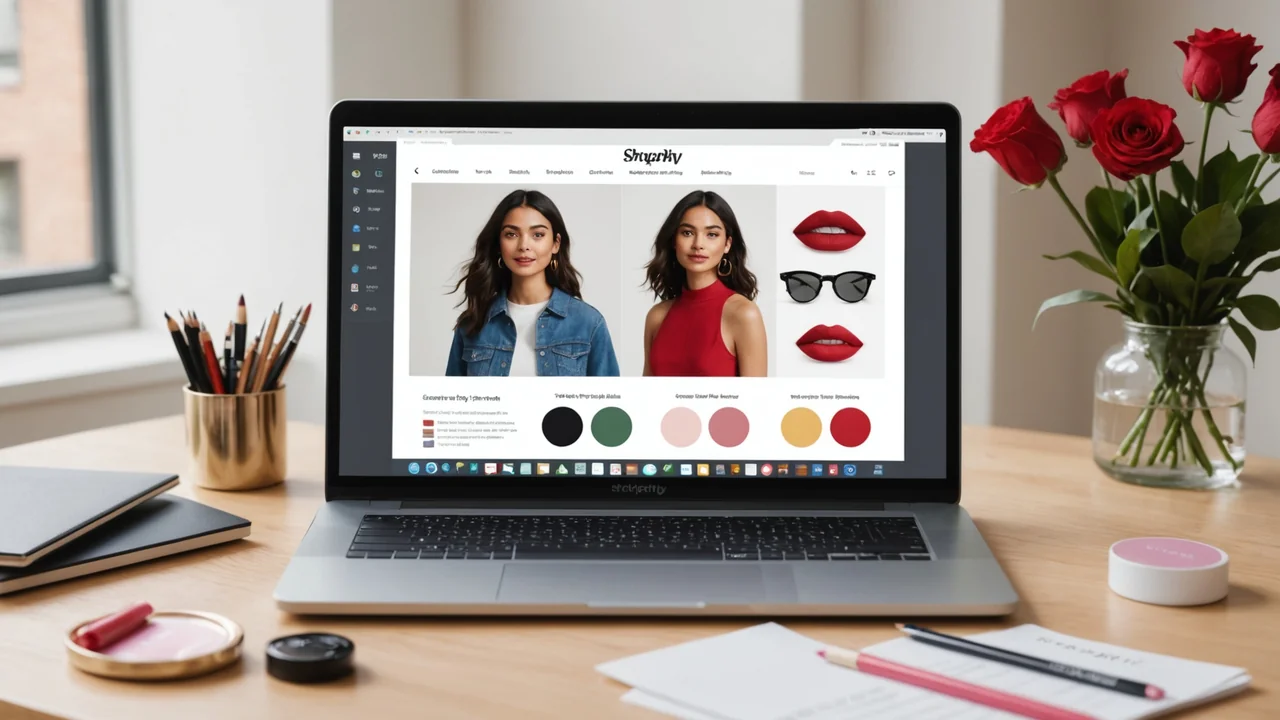
Shade Data: Get the Inputs Right First
The quality of your AR rendering is only as good as the shade data you provide. Sloppy inputs produce inaccurate outputs, and a shopper who tries on a "Dusty Rose" that renders as hot pink isn't going to trust the tool again.
- Audit your hex codes against physical samples. Assign a team member to cross-reference your brand's official hex values against actual product swatches under neutral daylight (5500K or daylight-balanced LED). Hex codes pulled from old campaign files or creative briefs sometimes drift from production reality. You want the render to match the real product.
- Tag finish type for every SKU. Each shade needs a finish classification: matte, satin, glossy, metallic, or duochrome. This isn't optional — the rendering engine selects a different pipeline for each. A shade tagged "matte" but physically satin will render without the slight specularity that makes satin look soft rather than chalky.
- Verify undertone metadata. Warm, cool, and neutral undertone designations affect how the pigment blends with the tone-matching system. If your catalog uses different terminology internally, map it to the standard before upload.
- Retire discontinued SKUs from the upload. Including discontinued shades creates confusion if shoppers try them on but can't find them in cart. Keep the try-on catalog limited to in-stock, purchasable SKUs.
Technical Integration: Before You Go Live
The embed itself is three lines of JavaScript, but there are still validation steps worth walking through before the button goes live to shoppers.
- Test the embed in a staging environment with the actual Shopify theme. Some themes apply aggressive CSS resets or z-index stacking contexts that can interfere with the try-on modal. We've seen this happen with themes that use full-viewport overlays for mobile navigation. Testing in staging catches these conflicts before they reach production.
- Confirm camera permission prompts are working. Modern browsers require explicit camera permission grants. Walk through the permission flow on iOS Safari, Android Chrome, and desktop Chrome/Firefox. On iOS, camera access from Safari in a Shopify-embedded webview has specific requirements — confirm the modal opens correctly in that context, not just in standalone browser.
- Check mobile performance on a mid-range device. The try-on should maintain at least 24 fps on a two-year-old mid-range Android phone, not just on the latest iPhone. If your target shopper is buying through a $300 Android, test on equivalent hardware. Performance on flagship devices doesn't tell you much about the real user experience distribution.
Product Page Placement and Copy
Where you put the Try On button and how you describe the feature has a surprising effect on click-through rates. We've observed a 22% difference in try-on engagement between brands that place the button immediately below the product imagery versus those that bury it below the fold.
- Place the Try On button above the fold on mobile PDP. "Above the fold" on mobile means within the first scroll viewport — ideally adjacent to the product image or the shade selector. Don't put it after the reviews section.
- Write a one-line trust statement near the button. Something like "No app needed. Your face data never leaves your phone." This removes the privacy hesitation before it forms. We've found this single line reduces abandonment from the try-on entry point by a meaningful margin.
- Update product descriptions to reference try-on availability. Adding "Try it on live" or "See how this shade looks on you" in the first two sentences of each product description increases try-on engagement from organic search traffic, because shoppers who read the description are higher-intent anyway.
Launch Communications and Team Readiness
The last two items are about people, not pixels.
- Brief your customer service team before launch. They'll get questions about how try-on works, what camera permissions mean, and whether the tool stores photos. Having clear, accurate answers ready prevents support tickets from becoming brand trust problems. Prepare a short FAQ for your CS team covering: how the feature works, data privacy, browser support, and what to do if it doesn't load.
- Set a baseline in your analytics dashboard before you activate. Pull the current add-to-cart rate, return rate, and average session duration for the SKUs you're AR-enabling. You need a pre-launch baseline to measure lift after launch. Brands that skip this step end up with try-on running for 60 days and no clean way to attribute the conversion improvement they're seeing — or not seeing.
The brands that get the most from their AR launch aren't the ones who spent the most time on the technology. They're the ones who treated the try-on experience as a product launch — with shade data integrity, customer communication, and baseline metrics all prepared in advance.
The Launch Window: Keep It Short
In our experience, a brand team that has completed all 12 of these steps can compress the final go-live sequence into a single afternoon. Shade upload, embed deploy, staging QA, and a quick team walkthrough — four hours of focused work if the prep is done. The teams that spend three weeks on launch are usually the ones who skipped the prep steps and are now rebuilding shade data or fighting theme conflicts in production.
Pre-launch rigor isn't bureaucracy. It's the difference between a try-on feature that becomes a conversion driver from day one and one that stays a novelty button nobody clicks.